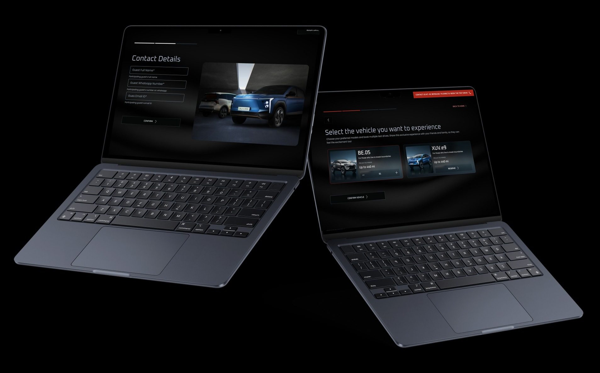
One design system for every SaaS product TPH builds
TPH designs and builds SaaS products for many clients. Each one needs the same building blocks, in its own brand colour. This is the system they all share: one set of tokens and components that can take on any client's brand, in light or dark, and that already covers AI chat and voice.
- The problem
- My role
Many products, one set of parts.
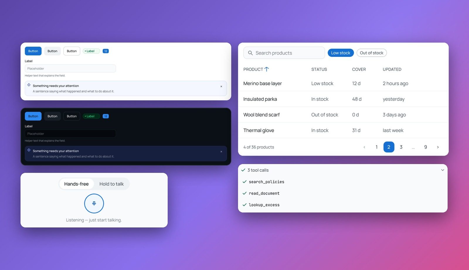
A dashboard for one client and an AI assistant for another look nothing alike from the outside. Underneath, they are made of the same things: buttons, inputs, tables, dialogs, toasts, empty states. Building those again for every client is slow, and every rebuild drifts a little from the last.
The system had to do three things at once: give every product the same reliable parts, let each one wear its own brand, and keep up with the AI and voice features clients now ask for.
What it had to solve
Three needs shaped the system
The same parts, rebuilt
Every new product started its tables, forms and dialogs from scratch, so no two worked quite the same way.
Every client has a brand
A shared library is only useful if a product can change its colour without redrawing a single component.
AI and voice had no home
Streaming answers, tool calls, sources and voice input were being designed one-off, product by product.
My role
I designed the system in Figma: the colour and type foundations, the token structure behind them, and the component library on top, including the AI conversation and voice components.
- Colour
- Tokens
- Brands
- Light and dark
- Type
02 A
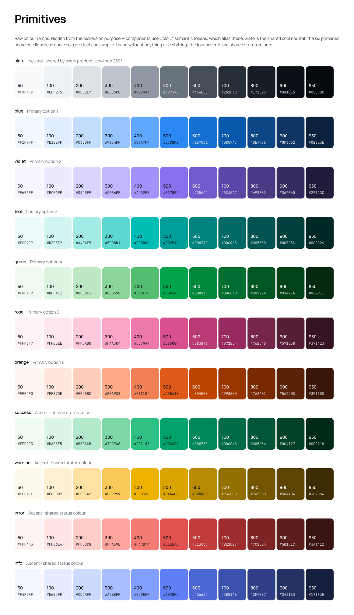
One neutral, six brands, four status colours.
Eleven colour ramps, each with eleven steps from 50 to 950. They are raw material: no component uses them directly.
- 01
One shared neutral
Slate, a cool grey, carries every surface, border and line of text, whatever the brand.
- 02
Six brands on one curve
Blue, violet, teal, green, rose and orange share the same lightness steps, so swapping one for another keeps contrast where it was.
- 03
Status stays put
Success, warning, error and info are shared across products, so a red error means the same thing everywhere.
Components never see a hex code.
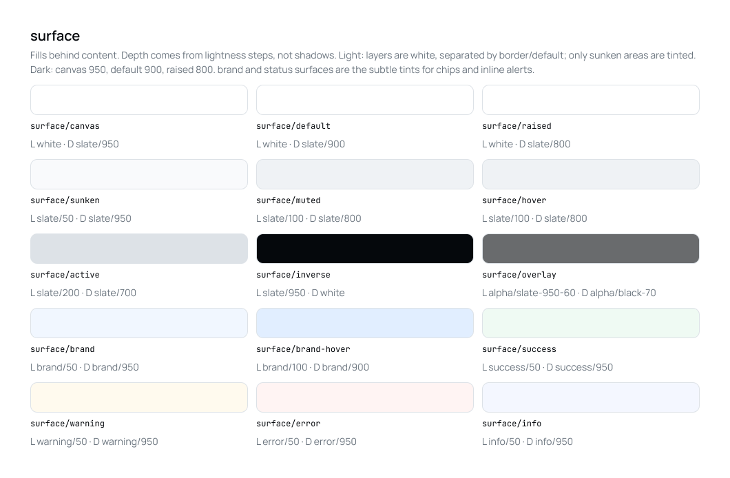
Between the raw ramps and the components sits a layer of semantic tokens, named for what a colour is used for rather than what it looks like: surface, text, icon, border, cta, status and chart. A card asks for surface/raised, not "white", and every token has a light and a dark value.
The raw ramps are hidden from the colour pickers on purpose. If a designer reaches for one, the rule in the file is simple: you are missing a semantic token, so add one instead.
02 B
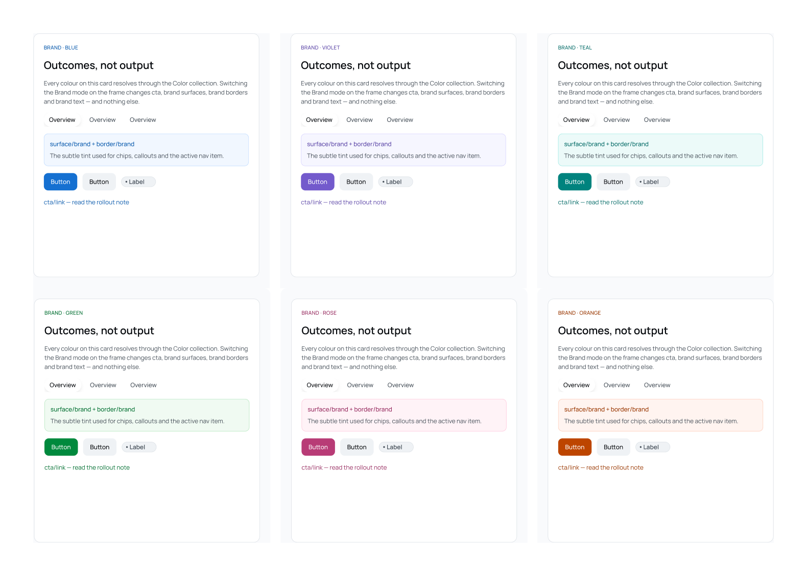
Switch the brand, and nothing else moves.
Each product picks a brand mode. Only the brand-coloured tokens change: buttons and links, brand tints, brand borders and brand text.
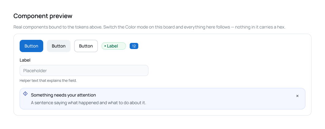
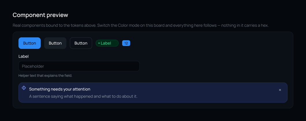
Light and dark from the same tokens.
Dark mode is not a second set of components. The same components are bound to the same tokens; switching the colour mode on a frame swaps every value at once.
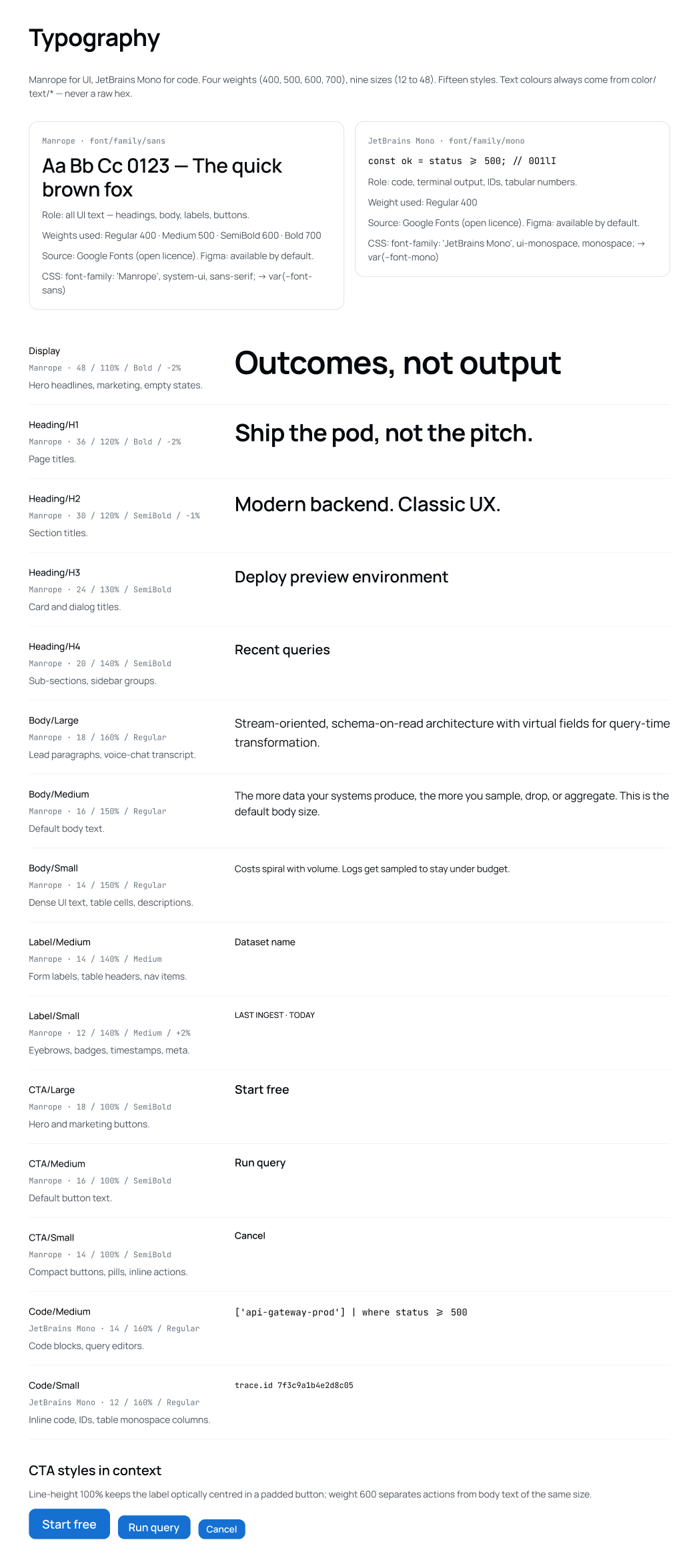
Two typefaces, fifteen styles.
Manrope for everything people read, JetBrains Mono for code, IDs and data. Fifteen named styles cover display, headings, body, labels, buttons and code, each with a note on where it belongs. Button labels sit at 100% line height so they stay optically centred, and a heavier weight keeps actions distinct from body text of the same size.
- The library
- AI conversation
- Voice
- Data
Sixty component pages, from buttons to AI chat.
The library covers what every SaaS product needs, and two families most libraries don't have yet.
The library
Three families of components
60 pages
Everyday product UI
Buttons, inputs, forms, tables, dialogs, drawers, menus, tabs, toasts, pagination, empty and loading states, navigation.
AI conversation
User and assistant messages, streaming text, thinking blocks, tool calls, citations, code blocks, approval and confirm cards, prompt input.
Voice
Voice bar, voice state, voice activity, call controls, transcript and audio player.
03 A
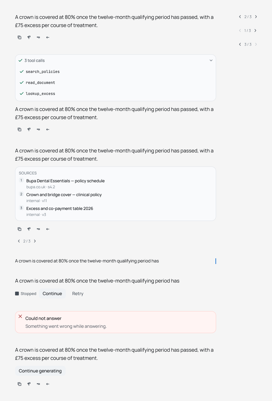
An AI answer has more states than a chat bubble.
An assistant message can be streaming, working through tools, citing sources, stopped halfway or failing. Each of those is designed, not left to the engineer.
- 01
Show the work
Tool calls collapse into one line with a count, and open to show each step.
- 02
Show the sources
Answers can carry numbered sources, with where each one came from and which version.
- 03
Plan for interruptions
Stopped answers offer Continue or Retry, and failures say plainly that something went wrong.
03 B
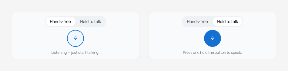
Two ways to talk.
Voice input comes in hands-free and hold-to-talk modes, with a line of text that says what the microphone is doing.
03 C
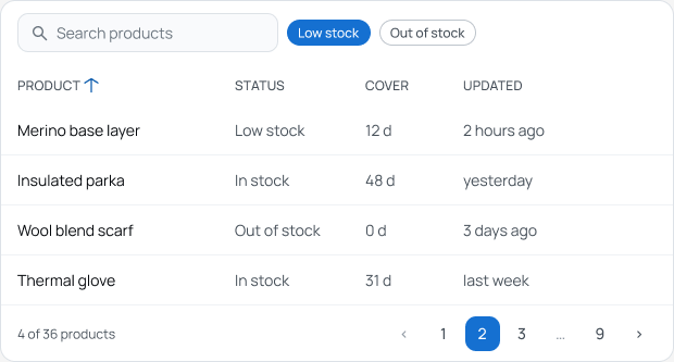
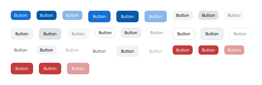
The everyday parts, done once.
The pieces every dashboard repeats, with their states included: sorting, filters, pagination, and every button variant down to disabled.
Instructions live in the file.
A system only works if people use it the same way. The file explains itself: how to switch brand and light or dark on any frame, which token groups to pick colours from, and the rule never to type a hex value. Every board shows real components bound to tokens, so changing a mode on the board proves the point.
Learnings
What I would take to the next system
Name tokens for their job
A token called surface/raised survives a rebrand. One called white does not.
Hide what you don't want used
Keeping the raw ramps out of the pickers did more for consistency than any guideline.
Design the in-between states
For AI, the streaming, stopped and failed states matter as much as the finished answer.